Part I
Well it was way back in 2009 when I first had the idea for adding testimonials to websites. So, I can say without any guilt that my vision for the service was my own, but did owe some credit to the service known as Poll Daddy.
As a web designer I had used Poll Daddy for clients and it was around then I thought,
“What if I could collect and deliver testimonials in a similar way?”
I searched for a similar service on Google and couldn’t find any of note. Then I did what a lot of entrepreneurs do with their ideas, I sat on it! I sat on it for three years.
It was during my IT consultancy stage in the financial sector that I stumbled upon a website that was doing something along the lines of what I had in mind. It wasn’t as simple or as user friendly, but the bones-of-it were there.
That made me sit up and take notice – “Hey, these guys got there before me!”
I had a few days of thinking – “Oh well, its back to the drawing board” and “No point in trying now!” But something made me certain that my idea had legs and that my idea was different to those already out there.
I decided it was time to take action and stop making excuses. My idea was a widget and theirs wasn’t.
The following week, I put a plan in motion. I did some preliminary work and searched for domain names.
Some of the domains I came up with where really not that great – reviewfeedr was one – not too bad considering the spate of domains ending suddenly with R’s. But then I also had the great idea to register a bunch of really questionable domains.
I had registered: Testifeed.com, .net, .org, .biz , .co.uk.
Then if that wasn’t enough, I registered the plural version of each! So Testifeeds.com and so on.
It took a while for it to sink in that my foresight in domain naming was flawed. The domains I registered were not fit for purpose. They sounded like a business that dealt in dodgy animal feed. It was time to go back to the drawing board and have a rethink.
It’s hard to make yourself enthusiastic at the best of times but trying to be enthusiastic for an ill-fitting domain is a big ask, and getting one that fits is crucial.
But then a great “Aha!” moment came. As it happens one of my other sites was using a great ping alert service called UptimeRobot.

I’m a big Asimov fan and Sci-Fi geek so I thought Robots were my thing! 
I did a quick search and was stunned. The perfect name was displayed before me and it was available! I immediately registered the name and that’s when the excitement for the project began.
Part II
Now that I had a domain TestimonialRobot.com, I needed a logo. I went through over 50 different format ideas for the logo, variations on a theme and completely obscure looking things.
Eventually I settled with a Robot body photo-shopped from a stock image and I bolted on two quotes to give meaning to the character.
Note on Logo:
That version of the logo served us well enough during the early stages but more recently I would like to thank the very talented Rob Dalton (illustrator / Artist) for his great re-imagining of our logo. We wanted a friendly but trustworthy character for the brand that also had a fun side to it
Our new mission is now to make collecting testimonials and reviews FUN!
Now that I had a domain and the makings of logo identity I went ahead and decided to take holidays and some unpaid leave from the the consultancy job in order to carry out the work to begin building a basic version of the website application.
I didn’t realize it at the time but what I was doing was building a Minimum Viable Product.
I had just bought a copy of The Lean Startup by Eric Ries and while reading I found I seemed to be going about the process in line with the principles of Eric’s suggestions. I was a Lean and Six Sigma project manager so that must have helped steer me to use Lean in my software implementation.
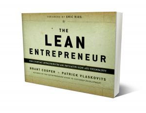
It was in November of 2012 that myself and Gabrielle got tickets to an Eventbrite talk in Dublin called The Lean Entrepreneur which was to given by Brant Cooper. This was an amazing insight to the world of using ‘Lean for Startups’ and a great primer on how to perfect your Customer Message when building a Minimum Viable Product.

Brant gave us some great advice and it led to us getting our first batch of Early Adopters.
By early Spring 2013 we were up and running with an MVP (Minimum Viable Product) as defined by both Brant and Eric. We started by offering the service to users with two options to choose from Free or Premium. After a few months we got so many new signups we had to sit down and think about how to make the system work without charging too much to our end users.
Note: We opted to refrain from getting into the technical details of how we went about building the MVP. This is ‘our story’ and not a technical article after all
In order to keep providing a good service I decided to stop offering the Free version to new signups. We needed to exercise some control over the signup process and make sure that the widget was used properly.
Also, as a Bootstrapped startup we needed to start making money in order to provide a quality service.
Time to Pivot? Yes, but only in a small way 
Soon to come – Part III